ASCII art is as much a part of the Internet as emoticons, cats, or lol.
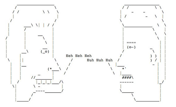
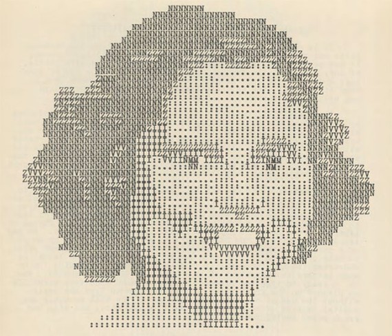
We're talking about pictures made from text: letters, numbers, and special characters like # * and \ . They look like this.
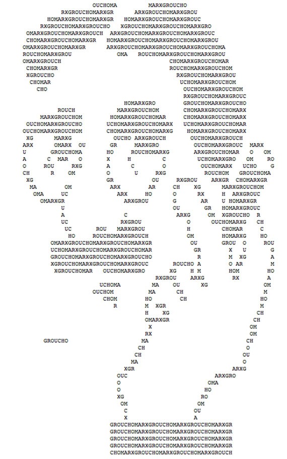
Sometimes letters are used just to form other, bigger letters.
And, of course, they are often used to create pornography.
Though it is still around today, ASCII art reached the zenith of its popularity before the web. It was the visual language of BBSs, Telnet, and many other pre-WWW networks. In a wholly text-based world, these works proliferated. For the brief moment that modems were the preferred mode of access to other computers, they were useful. And their sketchy aesthetic seemed right for mediums that were provisional and changing rapidly.
So, I've always thought of them as native creatures of that time, serving a need for pictures when there wasn't bandwidth to transmit them.
But that's not the case.
The history of ASCII art goes deeper, and much of it is told only in Geocities blog postings, abandoned websites, Google Books, and scattered PDFs across the web.
This post traces a fascinating and mostly lost strand of that history: The way thousands and thousands of people made typewriter art, from amateurs to avant gardists.
What they created is, in some cases, strikingly similar to the ASCII art of the BBS days, but how they thought about what they were doing depended on the times in which they worked.
Perhaps the one constant? This kind of text art has been snickered at and marginalized since the 1890s.
But as fewer and fewer typewriters clack away, striking ink to paper, and text continues to cede ground to the hypervisual web, a patina seems to be growing on the art form.
This spring, a new anthology will debut, Typewriter Art: A Modern Anthology, edited by Barry Tullett. And Lori Emerson, an English professor at UC-Boulder and director of the Media Archaeology Lab, has been excavating examples of mid-century "artyping." It was her tweets and posts that set me off on a journey to put together a rough sketch of the pre-history of ASCII art.
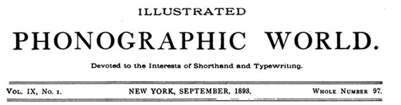
In September of 1893, a magazine called Illustrated Phonographic World, which was "Devoted to the Interests of Shorthand and Typewriting," struck back at two other publications for hating on typewriter art.
The Reporter's Journal agreed with the Phonetic Journal about "the foolishness of attempting to make sketches by means of typewriters." Furthermore, the London publication continued, "Some of our American contemporaries indulge largely in facsimiles of this class of work, and this has tended to foster the absurd custom."
Stung by the white glove, Illustrated Phonographic World set out to prove that typewriter sketches were indeed worthy of respect. "We believe that any endeavor which will cultivate painstaking and accuracy on the part of operators should be encouraged," they wrote. "The endeavor to excel in artistic typewriting unquestionable does this. The pen maketh the exact man; so will the typewriter, which is only the modern pen."
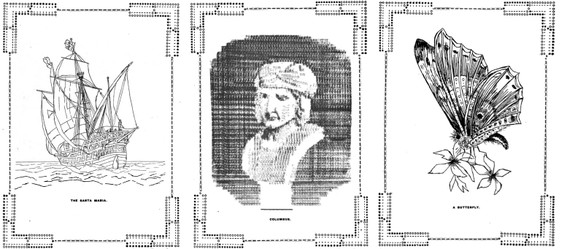
Along with this hearty defense, they published an image created by one Flora F. Stacey, of the Santa Maria, one of Christoper Columbus' ships and offered $5 in cash for a further "artistic specimen" sent in by readers. Of those they published three that I could find, including another by Flora Stacey, the butterfly on the right. In the middle, we find Christopher Columbus himself, courtesy of Mr. Frederick Carles of Boston, Massachusetts.
From the commentary at the time, people couldn't help themselves. Some people just liked making pictures with typewriters.
At least one scholar connected up typewriter art and pointilism as pointing the way to the idea of pixels on a screen being used to represent everything.
"Seen from a distance, the hundreds of dots, in virtue of the visual phenomenon known as persistence of vision, coalesced into larger figures," applied mathematician Philip Davis wrote of Georges Seurat's pointilism. "When in the 1880s typewriters became commonplace, this kind of image was done on the typewriter with letters or blank spaces, was known as typewriter art. In the first generation of computers, typewriter art was automated, and pictures of Washington, Lincoln, Harry Truman etc., were produced in this way. When computer output moved from the typed page to the television or video screen, the whole screen was subdivided into a certain large number, say 1,024 x 1,024 = 1,048,576 areas or so-called 'pixels', each of which could be addressed, shaded, coloured or otherwise transformed or manipulated."
In other words, the decomposition of images into lots and lots of little marks was a conceptual step towards the pixel. In this telling, typewriter art is not merely an ancestor of ASCII art, but of everything that goes on a screen. The television, the CRT monitor, the iPhone.
After the 1890s, typewriter art pops in and out of history. In the 1920s, Bauhaus artist H.N. Werkman made what he called "Tiksels." They are abstract pieces of typewriter art.
But typewriter art was not, generally, a high art form.
The Media Archaeology Lab's Emerson digitized a rare 1939 book called Artyping by Julius Nelson, a typing instructor at Windber High School in Windber, Pennsylvania, which had a population of about 9,000 people when the book was published.
Nelson sponsored the "Artistic Typing Competition" for more than ten years, drawing more than a thousand entries in some years, according to newspaper reports. And by the late '40s, he'd accumulated 12,000 examples of typewriter art.
In 1939, he'd just finished the first year and his enthusiasm for the form is evident in the preface.
"Although recently emerging from its experimental stage, "artyping" is still in its infancy," Nelson writes, "and if the host of typists throughout the world could have seen the variety of designs submitted to the author in a recent nation-wide artistic typing contest which he sponsored, anyone would have been more than willing to admit that really tremendous possibilities lie ahead to the ambitious, to the talented, and to the patient."
The rest of the book is composed largely of instructions and examples of the best of artyping in the day. This author and typist is ready to admit that there were a lot of people putting in a lot of hours at the keyboard.
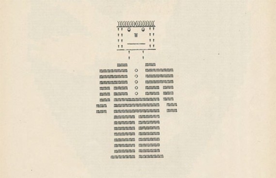
My favorite sequence shows how to construct "soldiers" on they keyboard. "No treatise on the subject of artistic typewriting would be complete without some reference to, and directions for, making 'soldiers' on the typewriter," he says. "There is something about this simple 'artyping' which is both fascinating and instructive, especially because it tests ingenuity and originality of the 'artypist.'"
The X and & form the torso and head. The / is the gun. The W becomes legs and the - feet. The brain does the rest.
Here's how it works in practice, GIF'd:

But this is the kid stuff. There were ornamental borders and ways of doing lettering.
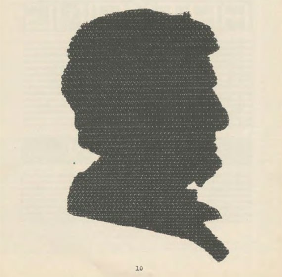
There are portraits, like this one of Lincoln, which Nelson notes, "was made by striking over twenty-six times. All of the letters of the alphabet were used."
There was a little man that Nelson nicknamed Typo.
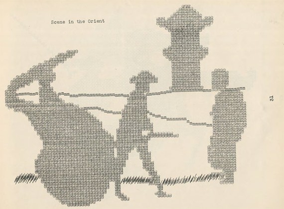
There was this "Scene in the Orient" made from @s.
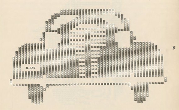
And a car made of Hs.
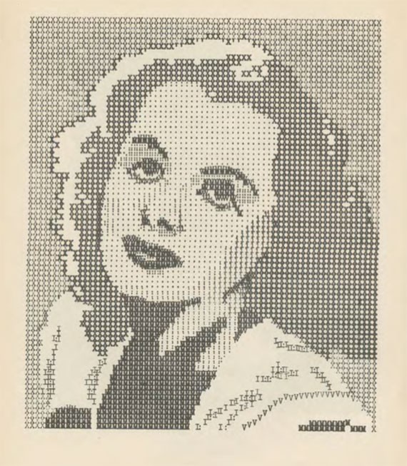
To me, though, it's the portraits that are most interestingly transformed by the process. Some of them assume a haunting quality, especially about the mouth and eyes.
Shirley Temple:
Comedian and musician Eddie Cantor:
And Hedy Lamarr (from this image):
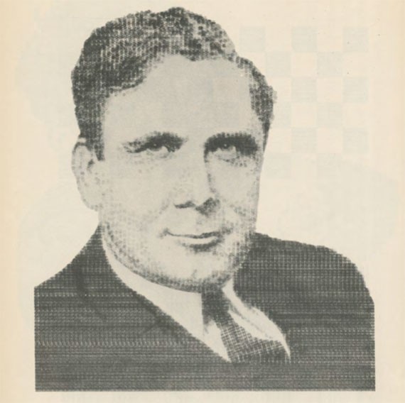
And Wendell Wilkie, the Republican nominee for president in 1940, who has nearly photorealistic levels of detail.
The penultimate page of Nelson's book finally gets around to the "uses of 'artyping.'" He mentions border design, novelty letters, handbills, monograms, letterhead, and then he allows the dream to creep in at the very end.
"Finally, an interesting hobby may be made out of 'artyping.' The 'artypist' may soon become expert enough to produce a design which may be accepted for publication in any one of the national publications featuring photographs. Like stamp collecting, 'artyping' may easily turn into a profitable hobby."
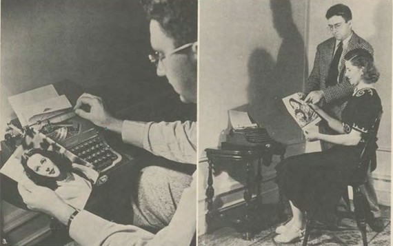
The year after he published the book, he appeared in an 11-minute short film by Paramount Pictures called Unusual Occupations.
"In Texas, Enid Justin makes cowboy boots that are highly sought after. St. Louis, Missouri resident Jerry Jarros builds scale model houses with wooden matches. Typing teacher Julius Nelson can type portraits of famous people. He types in a normal sequence, starting at the top of a sheet of paper, and the image is completed as he types down the page. Nancy Allen, of Cedar Hill, Rhode Island, runs her own volunteer fire department and is the first woman to be appointed a state district forest fire warden. Lastly, seafarer Ralph T. Luxford, of Hermosa Beach, California has trained his pet penguin, Pete, to perform numerous tricks. He has also made Pete a large variety of outfits in which to perform."
Not bad company. Nelson had made it big for a typing teacher teaching somewhere between Pittsburgh and Harrisburg.
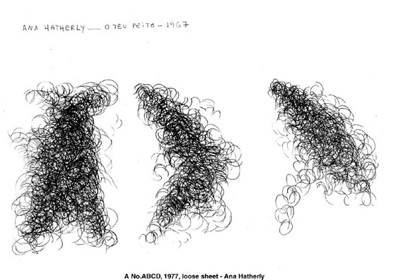
The typewriter art trail goes a little bit cold for a while after Nelson's mid-century successes. The way the story is generally told, we pick up with concrete or visual poetry in the 1960s or 1970s. It's easy to see why. The work that these artists produced is aesthetically impressive.
Ruth and Marvin Sackner maintain an enormous collection of visual and concrete poetry at their eponymous archive in Miami. They trace the roots of the work to people working just after Nelson's brief spin at stardom: "Öyvind Fahlstrom (1953), Eugen Gomringer (1953) and the Noigandres Group, i.e., Augusto De Campos, Haroldo De Campos, and Decio Pignatari (1955)." Their daughter made a documentary that streams on UbuWeb: Concrete!
By the late 1960s, the practices of visual and concrete poetry had spread far and wide. Typewriters were relatively cheap and there were established artist networks. The work grew in sophistication and complexity.
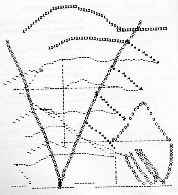
Behold just one page of the first panel of Steve McCaffery's massive poem Carnival, completed between 1967 and 1970.
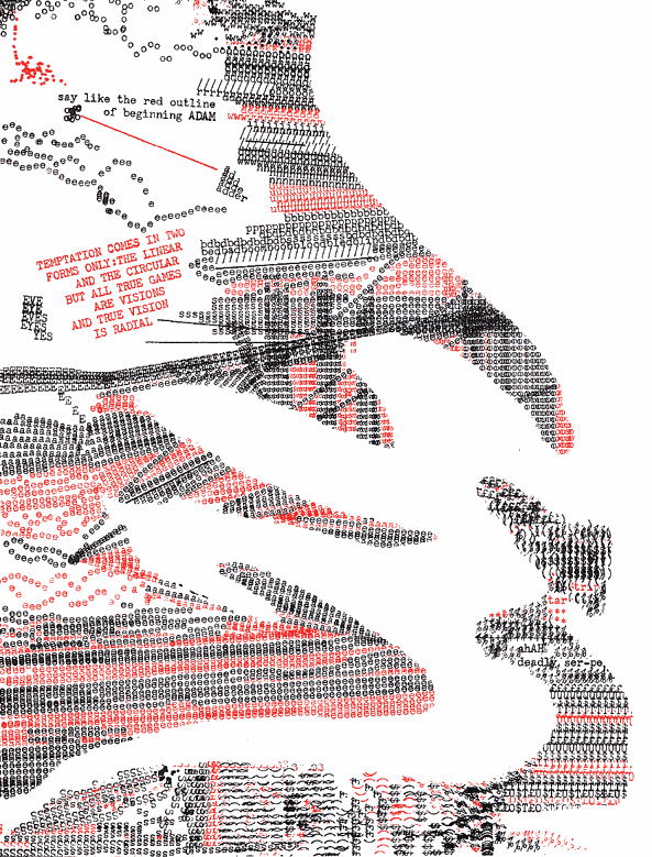
Assembled, the work flows in and out of abstraction at both the textual and visual levels. Letters are separated from language, but then flow back into it. Shapes are just words, but slip back into shapes as the eye continues to move around the work. It is a lava flow of symbols, sometimes hardening into rocks of meaning one way or another.
It's really quite amazing and it has been preserved online by Coach House Books in its entirety, praise be, along with other works by the artist.
But in the history of ASCII art, concrete poetry seems more like a fascinating uncle than a direct ancestor. Concrete poetry took advantage of the physical machine of the typewriter. ASCII art had no such luxury. The things you could do with a fixed-width font on a low resolution screen much more closely resemble Nelson's portraits than poems collected by the Sackners.
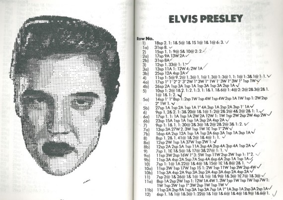
A more direct connection, at least aesthetically, is another book unearthed in Emerson's Media Archaeology Lab: Bob Neill’s Book of Typewriter Art (with special computer program). Published in 1982, it stands almost directly astride the emergent world of computing and the dominant world of typewriting.
In form, the book provides precise recipes for creating portraits. It's a bit like a knitting pattern. Want to make a portrait of Prince Charles or "The Arab" or a siamese kitten? Simply follow these easy instructions. They're presented in this form, though in this case, the directions run 99 lines long.
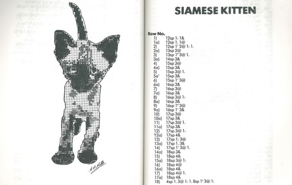
The coding is fairly simple. For one line, one might simply add 12 spaces, type "1: 1&" then go back and overstrike it with, "1. 1@" then move on to the other 98 lines. The simple conventions could be used to produce quite realistic portraits.
Emerson noted that this is some kind of halfway step towards the coding of the era. The book looks like "computer magazines from the early 1980s such as Byte that would include BASIC program." Then, one would retype the programs into one's own machine (hell, I remember doing this into the early 1990s). But "instead of computer code, we’re given typewritten letters as code," Emerson concluded. I might put it slightly differently: This is an algorithm executed by a human in physical space.
Appropriately, then, the book does include the text of a BASIC program for creating a portrait of Prince Charles. Here is a snippet:
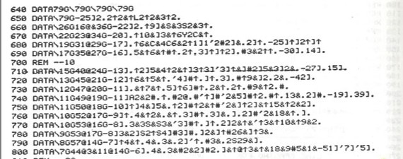
This is hardly more encoded than what the humans would execute themselves. 79G simply tells the computer to print 79 Gs. The computer here is only being used as a rendering, agent, a piece of electronic paper.
Evidently, Neill's fans were satisfied with his approach. It gave them a feeling of mastery over the machines of paperwork. He'd been publishing them in a magazine, and the testimonials from readers of that work open the book. One can't help but feel a sort of present superiority about their quaint delight.
"most enjoyable... you have created a new hobby for me." (L.B., London NW2)
"...fascinating to watch the picture build up after each line ... good fun." (D.D.W., Dunstable, Beds.)
"...I feel a sense of achievement" (Mrs A.B., London SW15)
"Our whole family is intrigued by this very clever method of drawing and we congratulate you on your originality" (Mrs. A.T., Turnbridge Wells, Kent)
"Thank you very much for ... an absorbing new hobby" (Mrs. F.G., Manchester)
I can only imagine Mrs. A.B. of London SW15 sitting before her typewriter making portraits of Persian cats and Princess Diana feeling such a sense of accomplishment that she dashed off a letter on the selfsame typewriter to the man who'd brought her such pleasure.
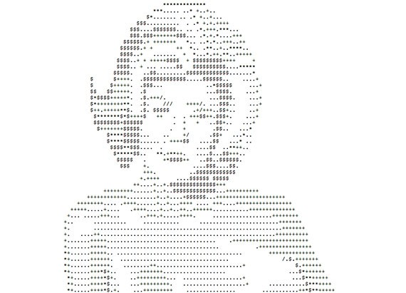
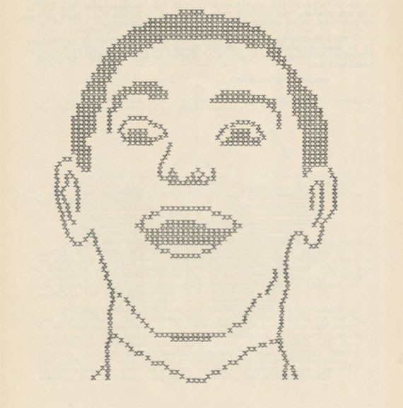
Today, there are software programs that can take any JPG and make it into ASCII art. Any image can become text with a few clicks of a button. Instead of creating an image line by line, one tweaks color, density, and character set settings to get the best results. I made this revision to Klimt with a $5 program from the App Store.
By the late 1980s, ASCII (or ANSI) art was circulating widely. In the BBSs of southern California and southwest Washington, I saw this kind of work. And KnowYourMeme pegs the start of USENET groups for sharing ASCII art to 1993. There were established artists in the "modem scene," as documented by time-capsule interviews like this one with "Neurodancer":
I started with the Amiga 1987. My first "scene" contact was in... hmmm, 1989, when I joined "Venom" as a musician. Before that, I've never been in any group except some selfmade bunch o' lamers. :) Ascii is one part of the stuff I do since... hmmm... my first contact with the modem scene, I think that was 1992. I saw the board logos and stuff at a friend's who was pretty active calling around (1600 DM in his first month - grin), and I really liked it. Just to satisfy my very own interest, I started doing a logo for the BBS my pal spent a lot of time on, Kiwi's "Digital Implosion". The logo was fantastic, brilliant, gorgeos, wonderful (of course, haha) - and too big. :)
Textfiles archives a collection of the early works including a substantial porn collection (because Internet).
It's hard to remember, but for a time, before the web, these images were everywhere.
I don't think that all these early networked people learned how to make pictures from Neill or Nelson or the concrete poets or even radio teletype operators, who have their own distinct RTTY art lineage dating back into the 1970s.
These things did not evolve one from the other, so much spontaneously regenerate down through the years, time and again. The idea for making pictures out of text respawns every time someone sits down in front of a computer and turns a colon and parenthesis into a human emotion.
:)
No matter what technology people find in their hands, they will make something outside the boundaries of the economic relations that placed the machine and their flesh in contact. Have you seen the NSFW tumblr tag for ASCII art? It's impressive and animated.
People like converting text into pictures and vice versa. There's an inherent pleasure to making one type of symbol into another.
Perhaps that's really what the concrete poets have to say to the artypists and ASCII artists. Indeterminate symbols are a way to resist the increasing quantification and automation of the economy. Bending these machines of industry to something so frivolous asserts something like what used to be called the human spirit.
And yet this resistance is small and inconsequential, a tiny, tweet-sized rebuke to the modern world. If there is no God, artyping is permitted.